Adaptive Controls
To design your desired Adaptive Document, it is important that you select the right elements to your document.
To add an element to your Adaptive Document's Composition area, use the element picker.
The element picker presents a list of controls grouped across various categories.
This article discusses the controls that are present in an element picker by default. The controls that become available for selection in an element picker based on the connections to a data table are a subset of the Input category of controls (discussed below).
A control may be present in two or more categories. However, the nature and features of the control does not change based on the category it is grouped in.
Features common to all
Although every control has its own unique features, there are certain characteristics shared by all controls. These are:
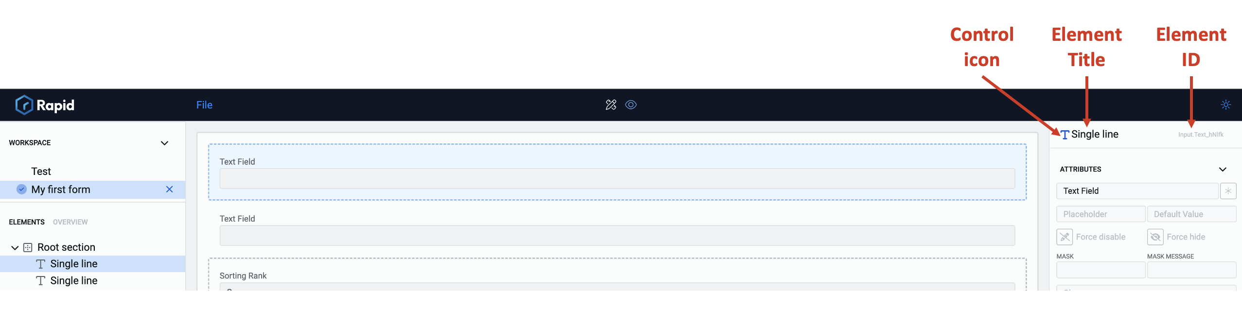
Element ID - Every control when added to the composition area as an element gets a system generated Element ID. This is the element's identification from the system. Two elements based on same control will have different ids. You cannot change an Element ID.
Element Title - You can define every element a title, irrespective of its nature. While an Element ID is a system generated string identifier for an element, an Element Title will help you better identify the elements as you can name them logically.
Every element has a title. If you have not manually set the title, the default title is the name of the control.
You can set the Element Title in two ways:
-
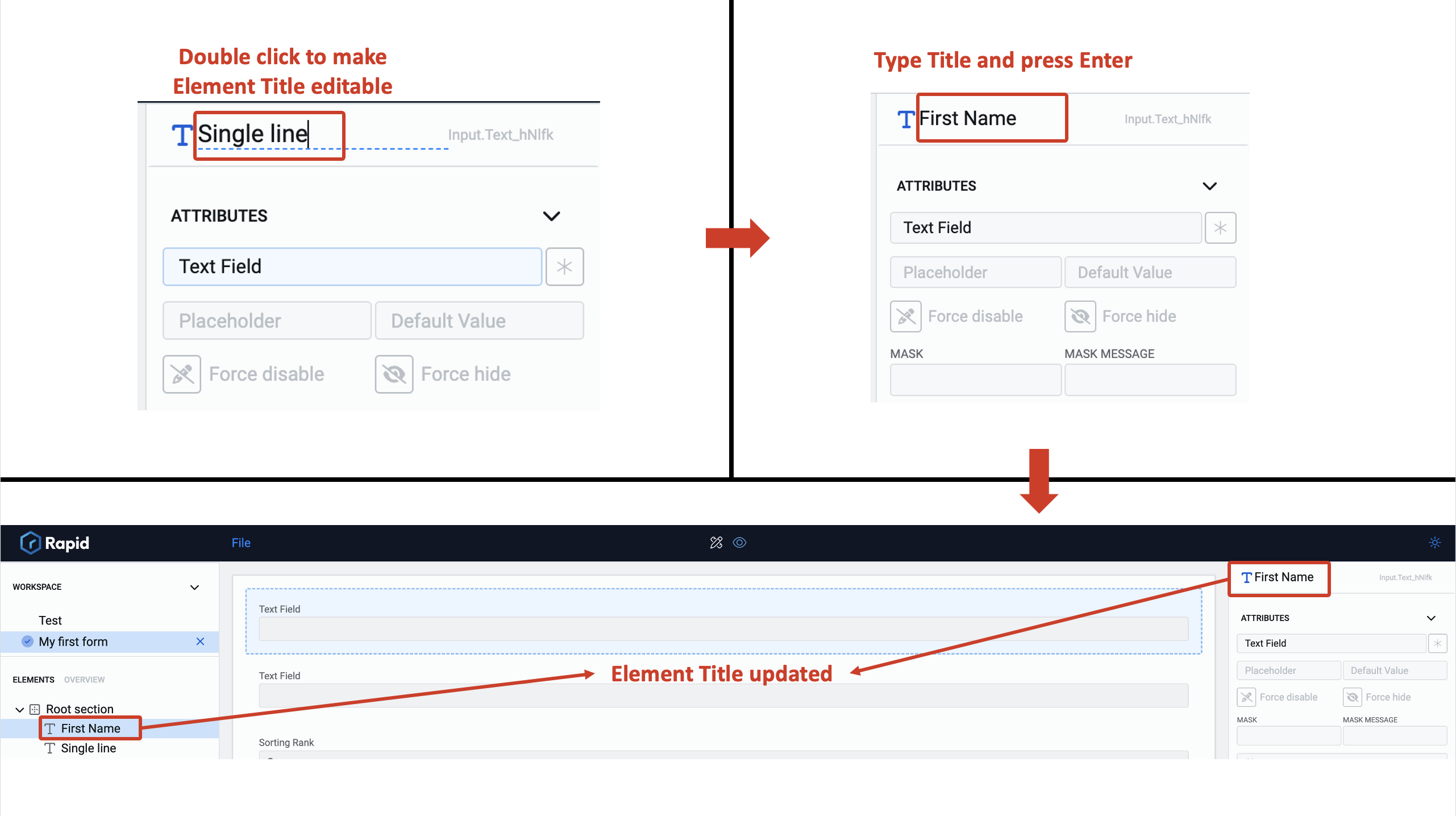
From the Element configuration panel :
a. Double Click on the title. This will make the Element title field editable.
b. Type in the desired title.
c. Press Enter.
The Element Title will now be updated with your typed text.Please note, the Element Title gets updated in the Document Structure Panel as well.
-
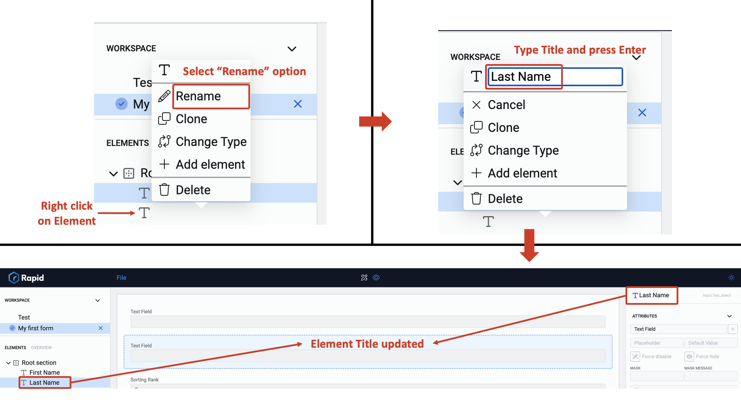
From the Document Structure Panel:
a. Right click on the element. This will open the options for the element in Document Structure Panel.
b. Select Rename option. The field to type Element title will appear.
c. Type in the Element Title.
d. Press Enter.
The Element Title will now be updated with your typed text.Please note, the Element Title gets updated in the Element configuration panel as well.
Control Icon - The control icon is visible next to the Element Title, depicting the nature of the element. Two elements based on the same control will display the same icon. You cannot update the icon.
Apart from these characteristics, all the elements can be configured for
a. Conditions
b. Validations
c. Connections
Individual element features
Let us now discuss all the individual controls.
Below is the list of controls grouped under categories.
Input category
This category includes all the controls that accept input from a user. For example - Single line, Number etc. There are 18 controls in this category.
- Single line
- Choice
- Currency
- Date-Time
- Date
- Multiple lines
- Number
- Percentage
- Radio
- Rating
- Slider
- Time
- Toggle
- Whole Number
- Lookup
- Multi Lookup
- Fill In The Blank
The number of controls in a category change as the newer versions of the Rapid Platform / Adaptive Designer are released. The above are the list of controls across the various categories at the time of writing this article (v1.40).